MW Hallen
(PRODUCT DESIGN & USABILITY TESTING)
THE CHALLENGE
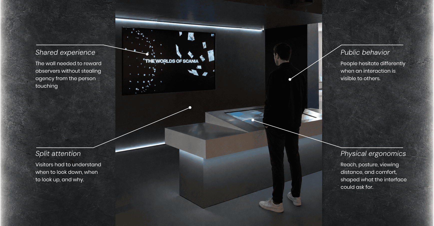
Designing a dual-screen experience required designing where people look, stand, touch, hesitate, and gather.
The project began as an interactive museum installation brief. But the defining challenge was not producing a polished table interface or a dramatic wall display. The real challenge was choreographing attention across two surfaces in a public environment.
Research and testing revealed a valuable lesson: a dual-screen setup can easily become a visual gimmick if the screens compete. The interaction model had to be crafted so the table, wall, visitors, observers, and physical room worked as one experience.
THE VISION BRIEF
From local roots to global impact.
Located in the reception area of Marcus Wallenberg-hallen (MW-hallen), the installation needed to tell the story of Scania beyond trucks: people, engineering, technology, data, sustainability, and global reach.
A concept render was presented to my team as an idea of the final vision. This was our starting point and where my research would begin.

THE SPATIAL CHALLENGE
The product lived in an open space, not in an enclosure.
The installation was to be located in the reception area next to the museum entrance. This meant it would also be located next to a cafe, working area, and shop. Potential users would approach from different angles and be exposed to other visitors. The decision to interact with the installation had to be easy and quick.
RESEARCH AND OBSERVATIONS
My research focus was mainly on the visitor behavior and content interactivity.
I studied different museum and experience centers, I interviewed several museum professionals, created personas, mapped visitor journeys, and tested interaction in physical space.
TWO SCREEN INTERACTIVITY
Designing attention across two screens
The initial idea treated the table as a controller and wall as content display. My research led to the team shifting focus from designing a controller-and-output system and instead started designing a relationship between attention, action, and the surrounding audience.
I created design principles for the interactions and relationship between the screens.
ITERATION AND TESTING
Exploring concepts and screen relationships
I created journey-based layouts that the team could iterate toward the final product. This included motion graphics and the interactive menus.
PHYSICAL PROTOTYPE
The prototype had to test the body, not only the screen.
Traditional screen prototypes could not answer whether people would reach comfortably, where groups would stand, how observers would follow the experience, or how the wall should behave when nobody was actively touching.

FINAL EXPERIENCE
A shared experience that lets information unfold through motion, sound, and exploration.
Through many iterations, the installation launched as a permanent experience within MW-hallen, combining interactive storytelling, dynamic lighting, ambient sound, CMS-driven content, and scalable content architecture.

"I did not know I was going to be this interested in numbers, but seeing all the different motions made me want to explore even more." - USABILITY PARTICIPANT
REFLECTION
This project changed how I think about experience design.
Designing beyond screens.
The challenge was never simply designing a touch screen. It was designing an experience that felt intuitive, immersive, and meaningful in a shared environment for both the body and mind.

More Projects

Digital Quality Standards
(UX RESEARCH & ENTERPRISE UX)
Scania lacked a shared definition of digital quality. Through research, enablement, and organizational influence, a quality framework became part of the company's strategic direction.

A/B Testing
(A/B TESTING & USER INTERVIEWS)
How comparative usability testing helped guide a global procurement decision for a new Master Data platform.
